Words are the best medium for conveying complex ideas. Always bet on text!
But there are cases, especially in science, where words alone may prove inadequate; where an idea has too many moving parts, or is so strange, that language alone would flatten the nuance or wonder it deserves.
This is especially true in biology, a field that (perhaps owing to its complexity or breadth) is often taught as a boring list of facts. “I should have loved biology,” writes James Somers, a contributor to The New Yorker, “but I found it to be a lifeless recitation of names…the Golgi apparatus and the Krebs cycle; mitosis, meiosis; DNA, RNA, mRNA, tRNA.”
This mirrors my own experience, too. “DNA replication has an error rate of less than one mistake per billion nucleotides” is a fine sentence. But is it clear what that really means? It’s difficult to grasp how mind-numbingly accurate that is without watching DNA replication happen. Words convey a truth, but not a nuanced understanding or sense of awe.
Most visuals in biology are descriptive, rather than explanatory. This is a big problem in textbooks, where students are likely to find a diagram of a mitochondrion next to a paragraph about mitochondria, or photos of DNA replication next to a description of the same. Removing these graphics would have no bearing on the ideas expressed in the text. The visuals are purely ornamental.
There are cases, though, where visuals make biology both more visceral (by turning abstract ideas into deeper “feelings”) and also more legible (expressing shapes, scales, or motions in ways prose cannot). In other words, they do real work. Consider this sentence about the denseness of a living cell, from the textbook Physical Biology of the Cell:
“If we imagine the molecules at a given concentration arranged on a cubic lattice of points, then the mean spacing between those points is given by d = c−1/3, where c is the concentration of interest (measured in units of number of molecules per unit volume).”
This is a (deceptively) beautiful sentence. It explains how tightly packed the molecules in a cell are, based only on their concentration. Glutamate has a concentration of about 100 millimolar, for example. Plug in this number, and you can quickly estimate that glutamate molecules are 2.55 nanometers apart on average; a length smaller than the width of a protein.
Now look at this painting by David Goodsell.
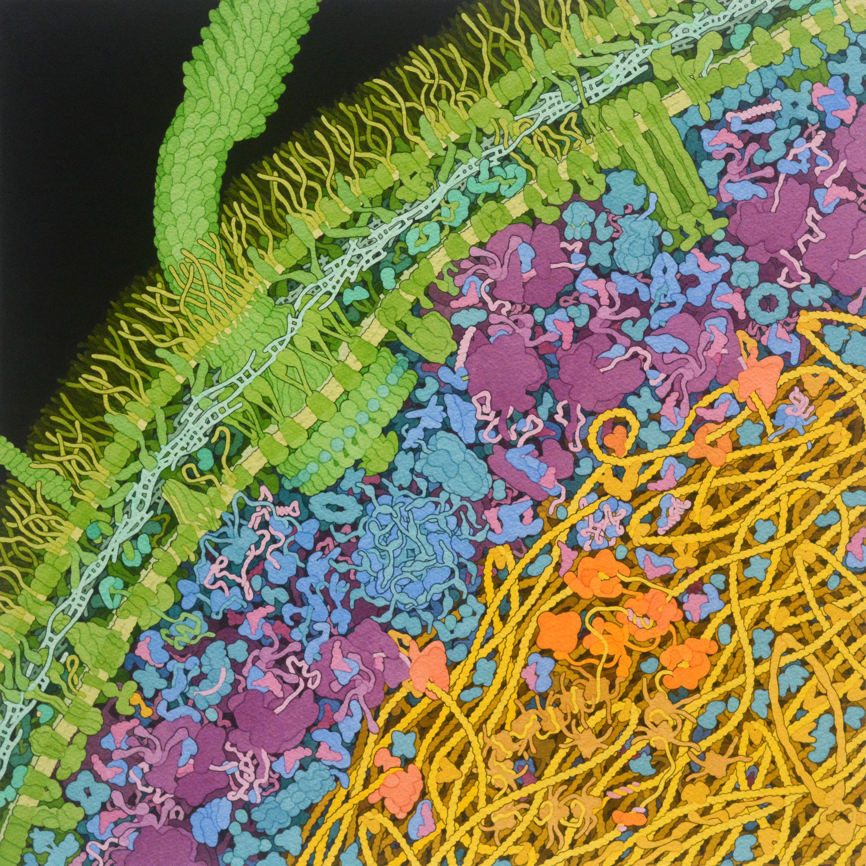
The painting is of an E. coli bacterium. And it gives the reader a way to reason about molecular crowding in a way they couldn’t with the equation alone. Words and equations may express a higher degree of exactitude—they precisely define crowdedness—but the painting gives an intuitive feeling for the same. This “expansion” of understanding, or the fact that the painting does explanatory work for the idea, is what makes it so appealing.
Visuals are not only a tool to make biology more exciting and legible. Visuals also benefit their creators.
I don’t know David Goodsell personally, but I’d guess he didn’t pursue painting with the goal of becoming famous. He probably did it for himself, as a hobby, to deepen his own understanding of the cell. It just so happens that his paintings also became a great way to pass that understanding on. By accident, his style became the de facto way an entire generation of biologists draws, and reasons about, proteins.
Visuals, in other words, are a way to understand, to convey that understanding, and to make an entire category of ideas more legible for thinking. Biology needs more of this. Biology is exceptionally broad, and so there is a lot of room to experiment. Showing a kinesin walk along a microtubule requires visuals that look nothing like enzyme kinetics, which looks nothing like evolution or population dynamics. Every visual in biology is effectively an n-of-1 experiment. Biology also spans orders of magnitude in both time and size; atoms jiggle at the femtosecond timescale whereas evolution plays out over millennia; chemical reactions happen at the angstrom scale whereas ecosystems span continents. No single visual representation can hold all of this scale, and I think that’s what makes visual design so exciting in biology.
Math and physics have a much richer tradition of “visuals that work.” 3Blue1Brown makes wonderful videos that explain abstract concepts in ways that text or equations alone cannot match. Biology has a lot to learn from the visuals in other scientific fields.
So I made a list of visuals that fit this mold, meaning they make ideas more legible or exciting, or both. Many of the links are to interactive essays, but some are videos, photographs, paintings, or charts. They span not only biology, but also other sciences.
There are a few related lists on the Internet; see Nicky Case’s explorabl.es, Distill.pub’s list of interactive articles, and these GitHub repos. Other lists tend to focus on mainstream news outlets and don’t typically include biology examples. My goal was to build a list that would help biologists, in particular, see effective visuals in varied formats, so they might be inspired to make their own.
This list is incomplete. If I’ve shared one example from a creator, there’s a good chance they have other excellent examples, too. Think of each link as a doorway, then, instead of a home. Please send suggestions and additions to nsmccarty3@gmail.com.
✦ = Recommended starting point.
Biology
Other Science
There are many papers and articles that lay out the “theory” or “philosophy” for visuals that elevate thought, and that I didn’t include in the list itself. See, for example, Edward Segel and Jeffrey Heer’s “Narrative visualizations: telling stories with data”, Andy Matuschak and Michael Nielsen’s “How can we develop transformative tools for thought?”, and Bret Victor’s “Explorable Explanations”.
Thanks to Lincoln Howarth for additions to this list.